
Mondrian's color palette, 1908 to 1943, as pie charts
Most people picture Mondrian as red, blue and yellow blocks with black lines. It took him more than a decade to get there. I took 5 of his paintings from 1908 to 1943, measured the 7 dominant colors in each, and turned them into pie charts to see what the road to those blocks looks like as data.
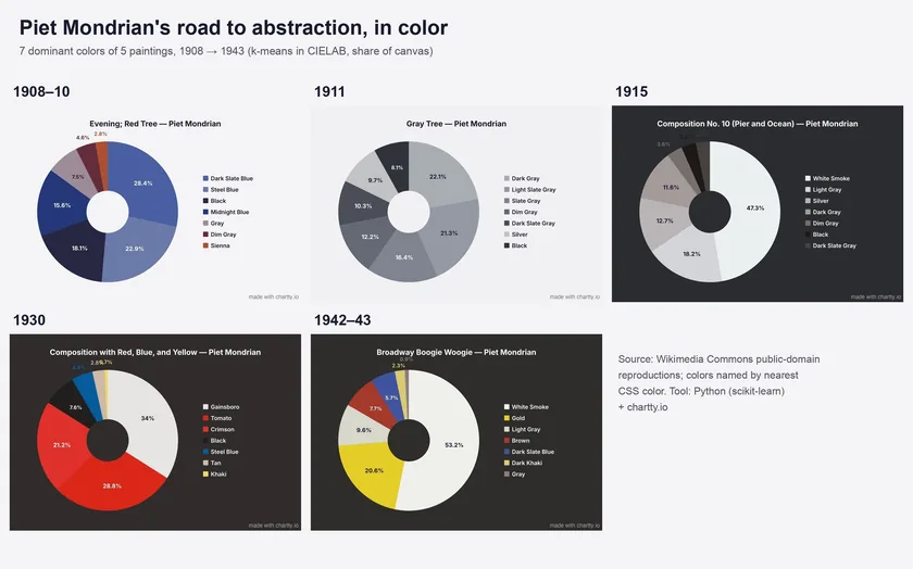
The five paintings
1908-10: Evening; Red Tree
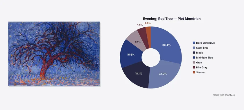
The painting is named after a red tree, and the tree gets 2.8% of the canvas (Sienna). Four blue and near-black clusters take 85%. The red is there, but it sits in thin branches on top of a blue field, and a pixel count doesn't care what you look at first.
1911: Gray Tree
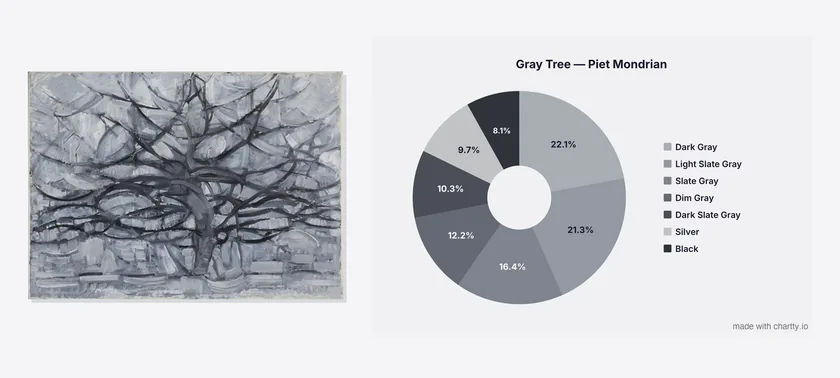
Three years later the color is gone. I asked the script for 7 colors and it returned 7 grays, from Silver to Black. The biggest one, Dark Gray, is 22.1%, so no single tone dominates either.
1915: Composition No. 10 (Pier and Ocean)
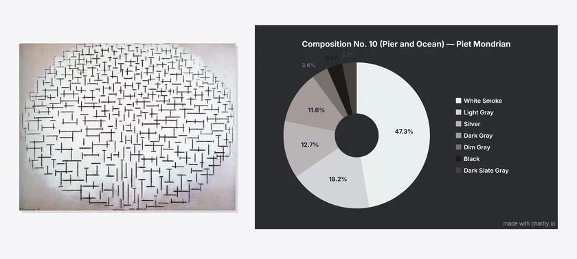
The tree is gone, and the pier and the sea are short black and white dashes. White Smoke takes 47.3%, and with Light Gray and Silver the light tones add up to 78%. The dashes themselves are thin, so they end up in the small dark slices (Black is 3.4%).
1930: Composition II in Red, Blue and Yellow
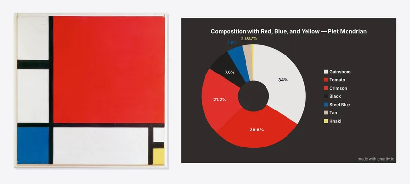
This is the one everyone knows, and the split is less even than the name suggests. Red is 50% (Tomato 28.8% plus Crimson 21.2%, two clusters for one big square). Blue is 4.9% and yellow is under 1%. The grid of black lines is 7.6%.
1942-43: Broadway Boogie Woogie
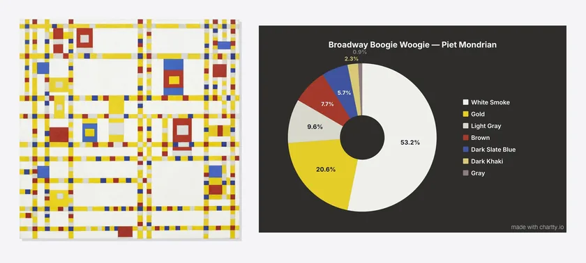
Mondrian painted this in New York, a year before he died. There's no black in the chart at all. The lines that used to be black are yellow now (Gold, 20.6%), broken up by small squares of red (Brown, 7.7%) and blue (Dark Slate Blue, 5.7%).
All the numbers
The biggest slice in each painting, and how much of the canvas the colors people associate with Mondrian take up:
| Year | Painting | Biggest color | Red | Blue | Yellow | Black |
|---|---|---|---|---|---|---|
| 1908-10 | Evening; Red Tree | Dark Slate Blue 28.4% | 2.8% | 66.9% | 0% | 18.1% |
| 1911 | Gray Tree | Dark Gray 22.1% | 0% | 0% | 0% | 8.1% |
| 1915 | Pier and Ocean | White Smoke 47.3% | 0% | 0% | 0% | 3.4% |
| 1930 | Composition II | Gainsboro 34% | 50.0% | 4.9% | 0.7% | 7.6% |
| 1942-43 | Broadway Boogie Woogie | White Smoke 53.2% | 7.7% | 5.7% | 22.9% | 0% |
Red, blue, yellow and black are my grouping of the CSS color names. For example, the 1908 blue is Dark Slate Blue, Steel Blue and Midnight Blue added together, and the 1943 yellow is Gold plus Dark Khaki.
How I made it
Same method as my famous paintings as pie charts post, where the full Python code is:
Public-domain image from Wikimedia Commons
  → Downscale to 800px
  → Convert pixels to CIELAB color space
  → K-means clustering (7 clusters, scikit-learn)
  → Name each cluster after the nearest CSS color
  → Slice size = share of pixels in that cluster
Then I put each painting's 7 colors and percentages into the pie chart maker, used the extracted hex colors for the slices, and exported JPEGs.
What this method gets wrong
Downscaling to 800px blurs thin lines into the colors next to them. That hurts Mondrian more than most painters, because his black grid lines are a few pixels wide. The 7.6% black in the 1930 painting is a lower bound, and some of the "Gainsboro" around the lines is likely black and white blurred together.
Fixed at 7 clusters, K-means also splits large flat areas. The 1930 red square came out as two clusters (Tomato and Crimson) probably because of shading and canvas texture in the photo. On the canvas it reads as one red.